


Editor's Note: This post now contains outdated information. Please read "managing the water leak" instead. Water Leak is available since SonarQube 5.3. Find the latest on SonarQube here.
After a Sonar analysis, it's easy to see your project's current state - just browse to the project dashboard and it's laid out for you. Want details? Just start clicking. But it's not always enough to know where you are. Sometimes, you need to know where you are in comparison to where you've been.
If code coverage is at 50%, is that a good thing, or a bad thing? On the face of it, you’d probably like a higher score, but if you’re up from 30%, it’s time for back slaps and high fives. Down from 70%? Time for some soul-searching.
The fact that Sonar's differentials make it easy to tell the difference is what I love most about Sonar. The fact that differential views are now available in four different places is even more exciting.
The first place is obvious: project-level dashboards (and Views and developer dashboards, if you're using Portfolio Management or Developer Cockpit). Look at the top-left of any project dashboard and you’ll see a date (the most recent analysis) and a dropdown:


By default the dropdown has 3 options: Δ since previous analysis, Δ over 5 days, and Δ over 30 days. Pick any one of those and the page is automatically refreshed. When it repaints, the trend arrows you saw next to each number are replaced by positive and negative numbers in parentheses. These numbers represent the change to each metric over the given period. Since you can customize the three periods globally, and add two more project-specific periods, it’s painfully easy to track quality changes over a week, a month, or since the last major version release!
If you've got any graphs on your dashboard, such as the Timeline widget, you'll notice that they contract to just the differential time period. If you're dealing with a project that's been under analysis for a while, this can be particularly helpful, because it takes the period of interest from a tiny wobble at the end of a long graph and lets it span the entire chart so you can see the details.
If you've got the SCM Activity plugin installed, you'll get a bonus here. Look at the code coverage widget and you'll see that a whole new section has been added.

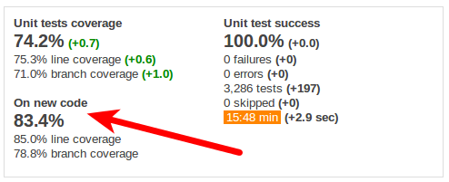
As you might guess from its title, the new section shows you coverage on new code. I.e. code that has changed or added. That means that if you're dealing with a legacy project that started at 0% coverage, you can use this extra section to track coverage on just what you're doing now, rather than having it muddled in with your backlog of missing tests. The result is that by focusing on coverage "on new code," you can hold both legacy and greenfield projects to the same fair standards.
So just by itself, differentials are pretty cool in the dashboard. But they get better.
Once you've picked a differential period, take a look at the violations widget. For each severity, you see the net change in violations, as well as the total counts of violations added and removed in the period.

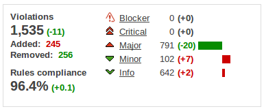
Click though on the number of added violations in red (assuming you have some) and you'll find yourself at the Violations drilldown, with the differential selection applied.

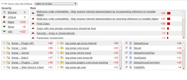
Now you can see not just the number of violations that were added, but where the violations are and what rules they broke. And when you click on a file name, the violations you're shown in that file will be filtered to just the ones added in the period of interest.
While you're here, click over to the file's Source view. If you have the SCM Activity plugin installed, you'll see a differentials dropdown here as well. That means you can see what larger source changes those violations were a part of.
The final place to look for differentials is in the file's Coverage view. You'll see there's a dropdown here as well, making it easy to see how your test coverage has changed over time. But you don't have to look at it just file-to-file. Head back to the dashboard and reapply the differential period if you have to. Then click through on any of the "On new code" metrics in the Code coverage widget. That's right! you get a drilldown focused on just new code coverage.
If you haven't used differentials yet, it's time to dive in. You won't believe the difference they can make!